


Pedro Pascal: De Chile a Hollywood, la historia de un actor internacional
Pedro Pascal, cuyo nombre completo es José Pedro Balmaceda Pascal, nació el 2 de abril de 1975 en Santiago de Chile. Desde temprana edad, mostró un gran interés por la


How to Distinguish Genuine Historical Facts from Popular Myths
Throughout history, stories have been passed down with such conviction that many people accept them as truth without question. Legends, rumors, and half-remembered tales often become woven into the fabric of our collective understanding of the past. Yet, distinguishing genuine historical facts from widely repeated myths is a crucial skill, particularly in an age where information spreads faster than ever before. A good starting point is to recognize that myths often flourish because they serve cultural, political, or emotional purposes. They provide simple explanations, moral lessons, or national pride, even when the evidence supporting them is weak. In contrast, historical facts rely on verifiable sources, critical examination, and corroboration by multiple lines of evidence. Scholars spend years piecing together records, artifacts, and eyewitness accounts, which are then evaluated for consistency and reliability. Looking carefully at who recorded an event, when they did so, and why they might have told the story in a certain way helps uncover hidden biases that can blur accuracy. Furthermore, myths often thrive on dramatic narratives that are almost too perfect—or too convenient—to be true. They may feature heroes, villains, or turning points that resonate emotionally, shaping how events are remembered rather than how they actually unfolded. Genuine history, by contrast, is usually far more complex and nuanced, often resisting neat storylines. By practicing skepticism, comparing multiple perspectives, and consulting credible sources, anyone can learn to tell apart the enduring myth from the authentic fact, deepening not only their knowledge of history but also their understanding of how stories shape the way we see the world today.


Pedro Pascal: De Chile a Hollywood, la historia de un actor internacional
Pedro Pascal, cuyo nombre completo es José Pedro Balmaceda Pascal, nació el 2 de abril de 1975 en Santiago de Chile. Desde temprana edad, mostró un gran interés por la


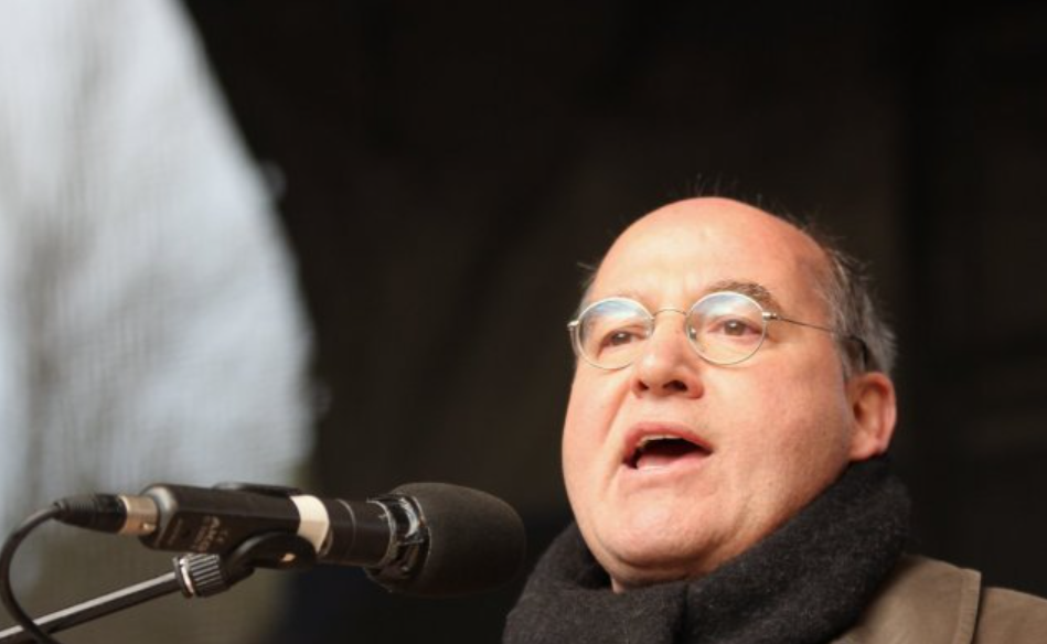
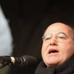
Frank-Walter Steinmeier: Ein Leben im Dienst der Politik
Frank-Walter Steinmeier, geboren am 5. Januar 1956 in Detmold, ist ein deutscher Politiker, der seit 2017 als Bundespräsident der Bundesrepublik Deutschland im Amt ist. Er ist Mitglied der Sozialdemokratischen Partei