Now Reading: How World Maps Are Created and Why They Look Different
-
01
How World Maps Are Created and Why They Look Different
How World Maps Are Created and Why They Look Different

Understanding the Complex Process Behind World Map Creation
For as long as people have looked up at the sky, crossed seas, or wandered across landscapes, there has been a human desire to record the shape of the Earth and the places within it. World maps are the ultimate expression of that effort: attempts to put the entire planet—vast, spherical, and unimaginably complex—onto a flat surface that we can read, compare, and use. Yet, while we may take a classroom map or a digital globe for granted today, the process of creating a world map is anything but simple. It is the result of centuries of trial, error, innovation, and cultural influence.
In ancient times, the earliest cartographers relied on observation and stories more than precise measurement. Babylonian clay tablets offered symbolic representations of the world, not detailed geography. Greek thinkers like Eratosthenes began to apply mathematics and astronomical observation, even calculating the Earth’s circumference with impressive accuracy for the second century BCE. Later, scholars working in the Islamic Golden Age refined geographic knowledge by preserving and building on Greek and Roman works while adding their own advances in measurement and navigation.
The Age of Exploration in the 15th and 16th centuries transformed mapping forever. As European sailors ventured farther across oceans, maps became critical for survival. Precise coastlines and navigational routes had to be charted. This period introduced not only detailed landmasses unknown to earlier civilizations but also the challenge of map projection: how to flatten a round Earth onto parchment. Early mapping techniques often required astronomical calculations, geometry, and increasingly, systematic surveying.
Modern cartography builds on that legacy with incredible technological leaps. Today, satellites orbiting Earth gather billions of data points every second. GPS systems track positions to within a few meters. Sophisticated computer models combine this information with mathematical projections to create digital atlases, interactive maps, and real-time navigation tools. With this technology, anyone can zoom in on a remote coastline or trace the movement of airplanes globally. Yet even with such precision, world maps remain approximations. Earth’s surface is curved, and a flat map can never capture its entirety without some degree of distortion.
At its heart, then, every world map is both a technical tool and a cultural artifact. It reflects not only the science of its time but also the priorities and values of the societies that created it. A map may emphasize political boundaries, sea routes, natural features, or urban networks depending on its intended use. In this sense, maps do not merely replicate reality; they interpret it, shaping the way people imagine space and their place in the world.
Why Different World Maps Appear So Distinct From Each Other
If all maps represent the same planet, why do they look so different from one another? The answer lies in the unavoidable compromises involved in projecting a three-dimensional Earth onto a two-dimensional surface. Cartographers must make choices between preserving the shapes of countries, maintaining true area proportions, or keeping compass directions useful for navigation. No projection can achieve all of these goals perfectly, which is why world maps vary so widely.
Consider the Mercator projection, created in 1569 for sailors. It preserves straight compass bearings, making it excellent for navigation. However, it does so by enormously stretching regions near the poles. As a result, Greenland appears roughly the size of Africa, though in reality Africa is about 14 times larger. This distortion shaped how generations of people perceived power and size in the Northern Hemisphere, unintentionally giving more visual prominence to Europe and North America.
In contrast, the Gall-Peters projection, introduced in the 19th century and popularized in the 20th century, aimed to correct these imbalances. It represents landmasses in accurate proportion to their area, showing Africa and South America much larger in relation to Europe and North America. But this method sacrifices familiar shapes, stretching continents vertically and leaving them looking unfamiliar to many viewers.
These differences illustrate an important point: maps are never neutral. Their design communicates subtle messages about importance, centrality, and power. A map centered on Europe portrays the world differently than one centered on the Pacific. Some world maps expand specific territories or shift orientations to underline political narratives. For example, maps used in classrooms across different nations sometimes highlight their own country in the middle, reinforcing a cultural worldview that places the homeland at the center of global perspective.
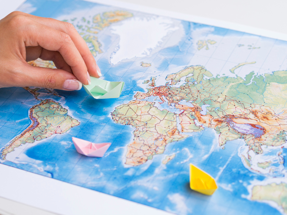
Visual design choices—color schemes, borders, labels—add another layer of influence. A map with bold political boundaries emphasizes nation-states and sovereignty. A physical relief map, by contrast, draws attention to mountain ranges, deserts, and rivers, reminding us of landscapes rather than human divisions. Meanwhile, modern digital maps, such as those built into navigation apps, prioritize roads, businesses, or driving times, shaping our perspective of geography around daily utility.
When two different world maps are compared side by side, the variations can be surprising, even confusing. Viewers may wonder why Greenland sometimes rivals Africa in size or why Australia appears compressed in certain projections. This confusion stems from the inherent trade-offs of flattening the globe. Each map is optimized for specific goals—sailing, teaching, or visualization—but never achieves a “perfect” representation of reality.
Yet this diversity is not simply a flaw; it is part of the richness of cartography. Different projections force us to think critically about how we see the world and about the messages hidden within map designs. They remind us that geography is not just a set of fixed facts but also a story shaped by perspective, politics, and purpose. Ultimately, no map can fully capture the vast complexity of the Earth, but each representation provides a useful lens—one that helps us navigate, learn, and reflect on how societies understand their place in the world.
Final Thoughts
World maps are the product of centuries of knowledge, exploration, and technological achievement, yet they are also works of interpretation shaped by cultural values and practical needs. Whether carved into ancient tablets, drawn on parchment, or displayed on a digital screen, they reflect both the precision of science and the creativity of human imagination.
The differences between world maps remind us that no single image tells the whole truth about our planet. Instead, each map offers a perspective—one that might emphasize navigation, fairness of land area, political boundaries, or natural formations. By recognizing the choices behind every map, we gain not just a clearer understanding of geography but also a deeper awareness of how humans perceive, prioritize, and present the world around them.


